
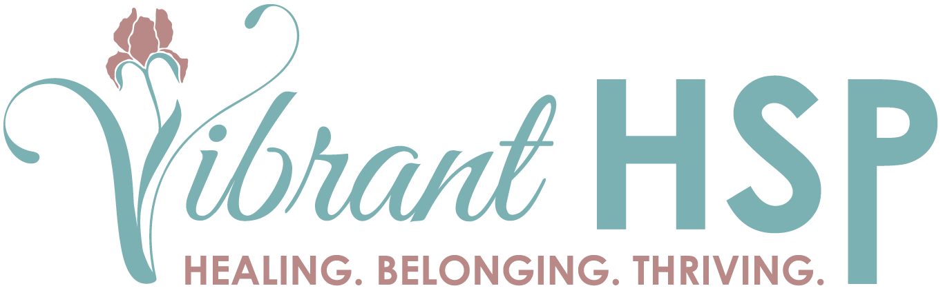
SKETCH TO VECTOR
– Preserving the Soul of the Original
– Preserving the Soul of the Original
This project showcases how I transform hand-drawn elements into clean, scalable digital assets – without losing their organic charm. The goal was to maintain the original flow and personality while refining structure, balance, and line quality for a modern identity system.
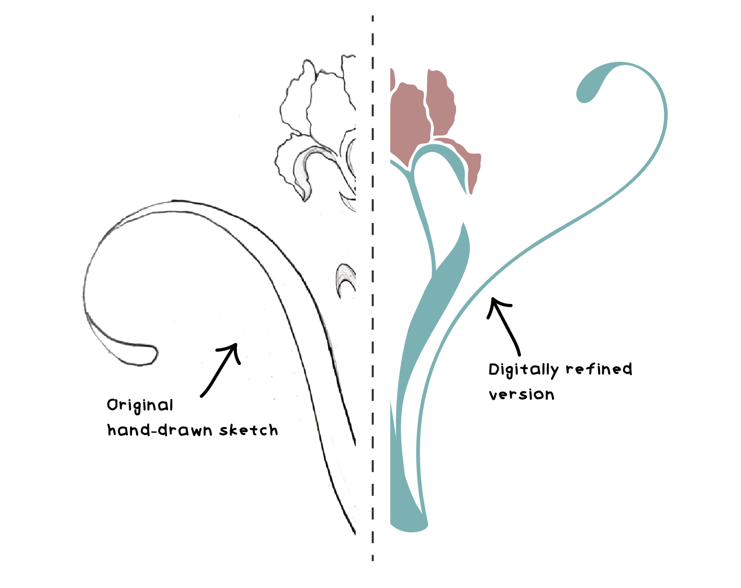
The logotype was created for https://vibranthsp.com.
I wanted to create a visual that captured the calm, gentle energy the client was looking for. We built it around her chosen colors and art direction.

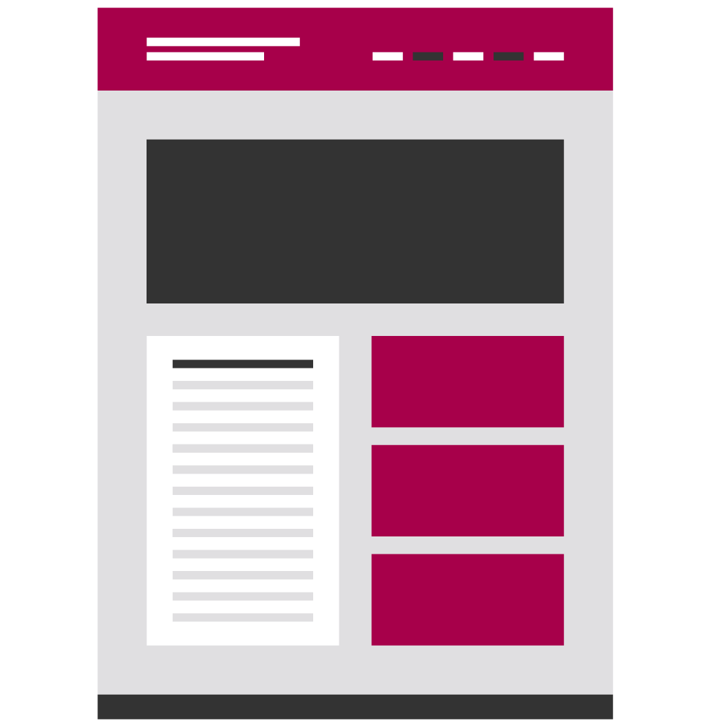
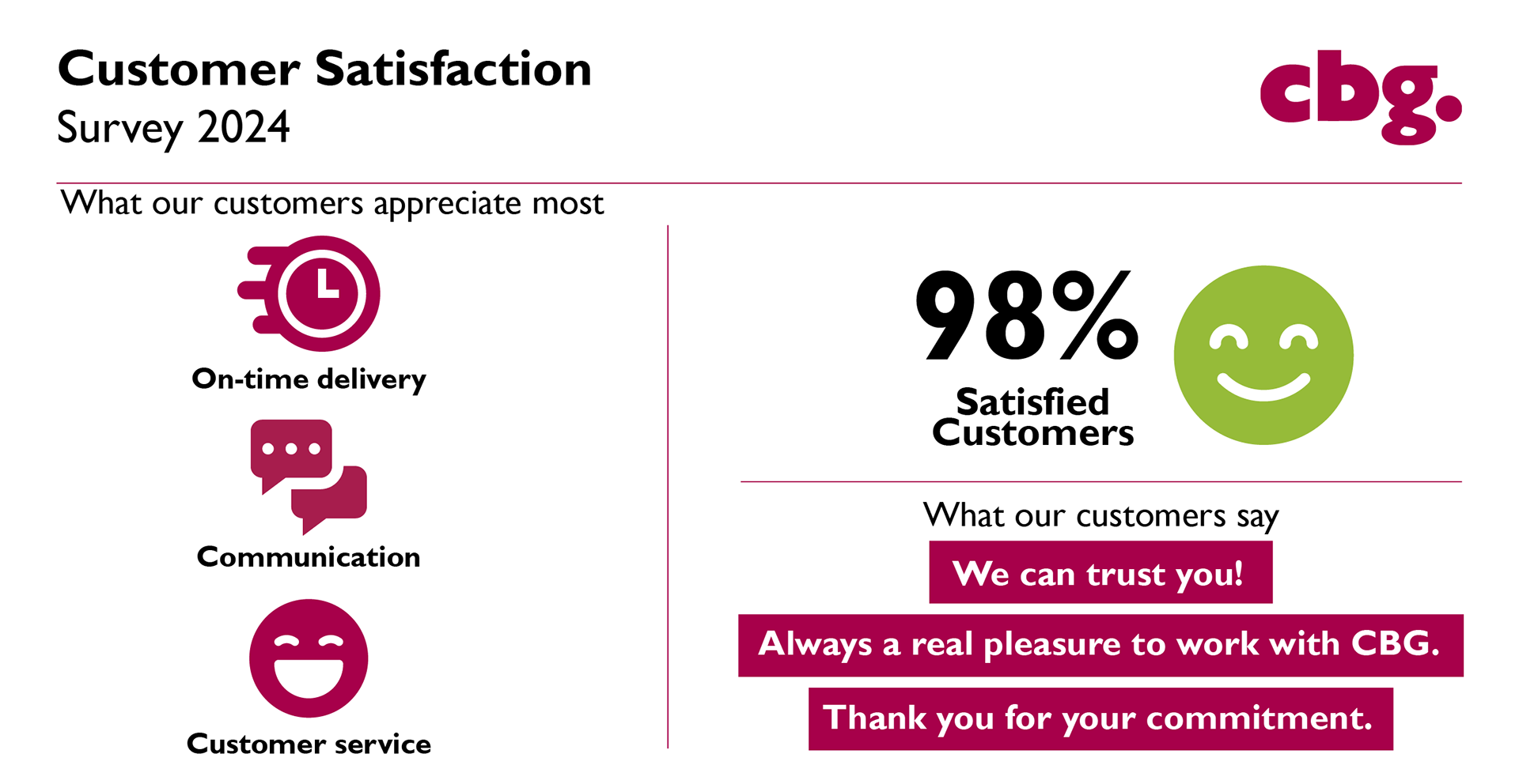
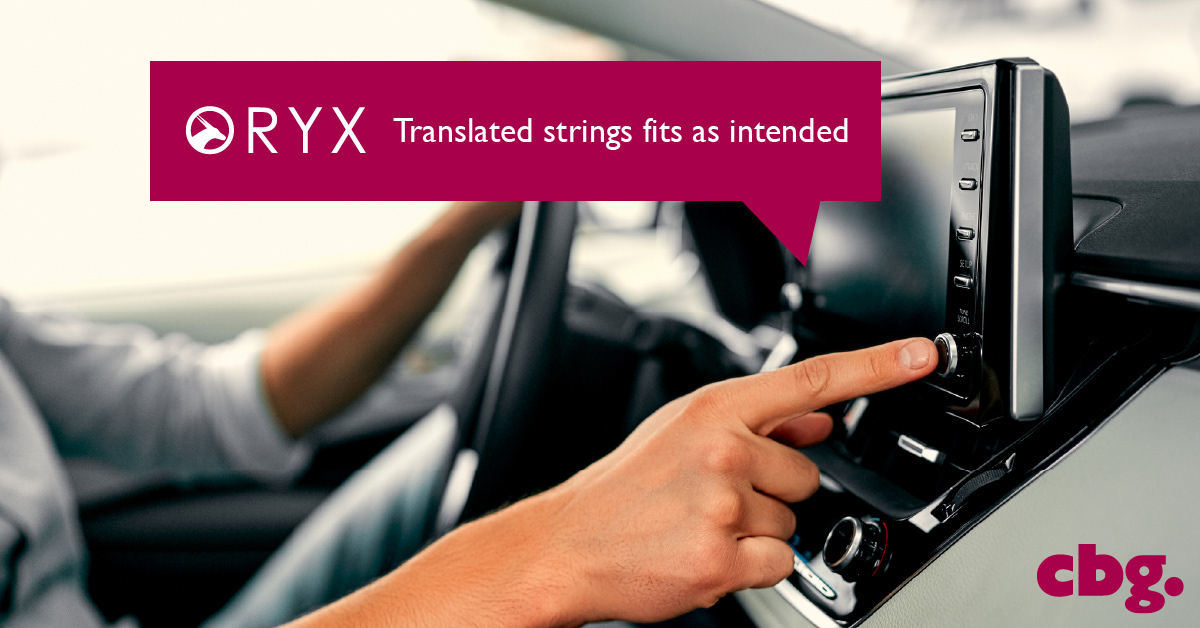
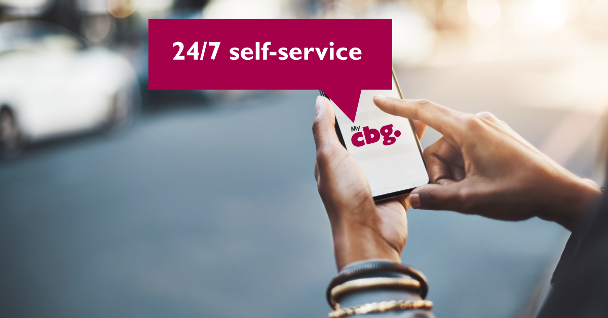
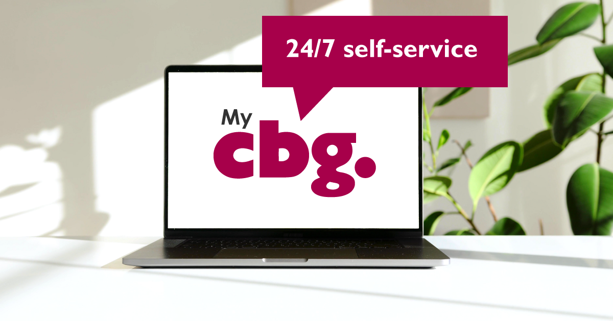
LINKEDIN VISUALS
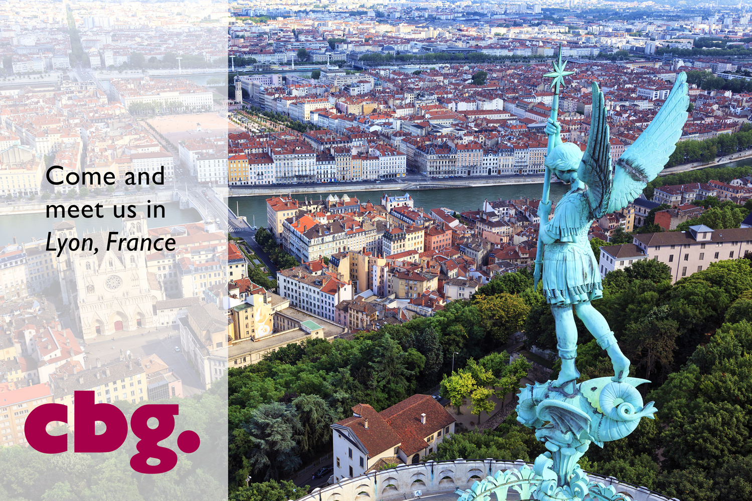
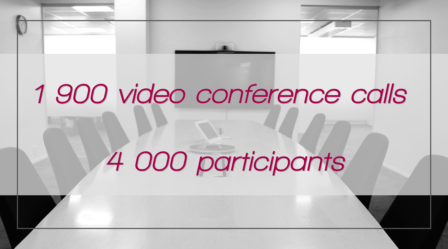
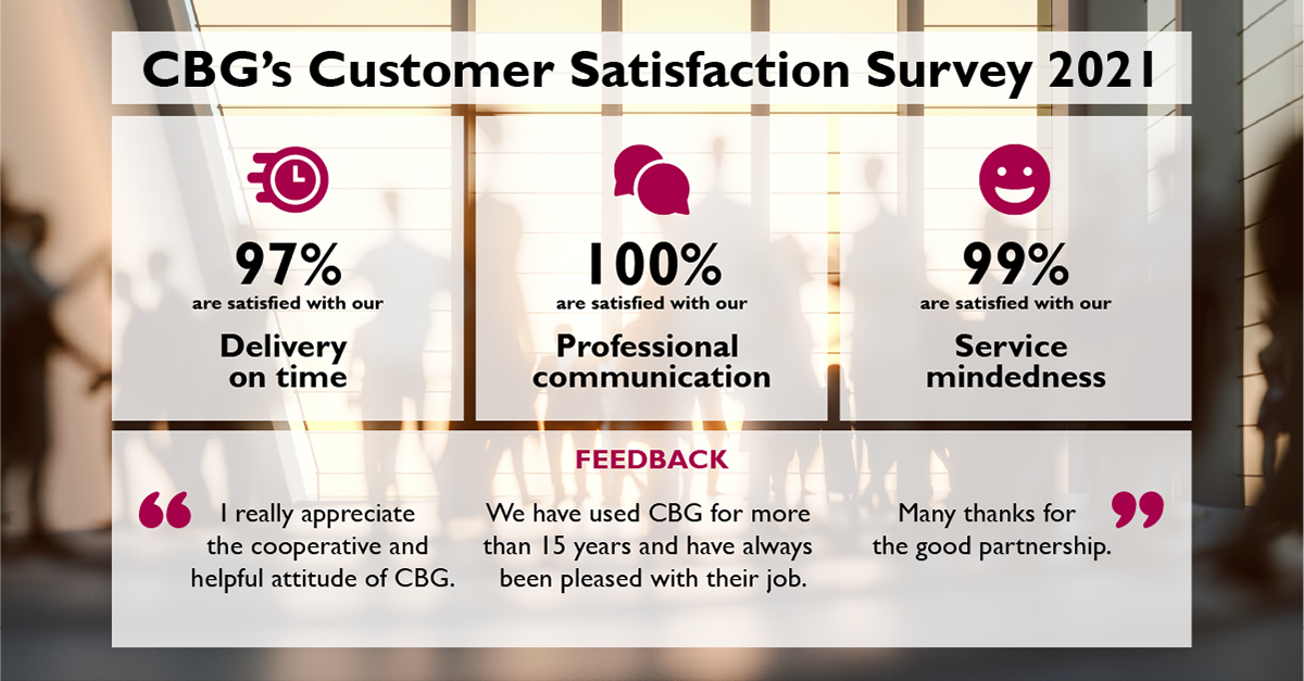
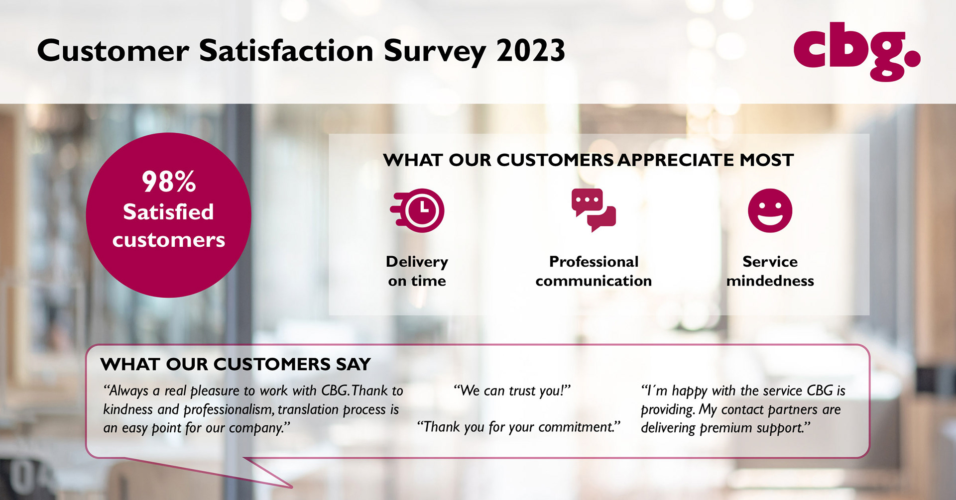
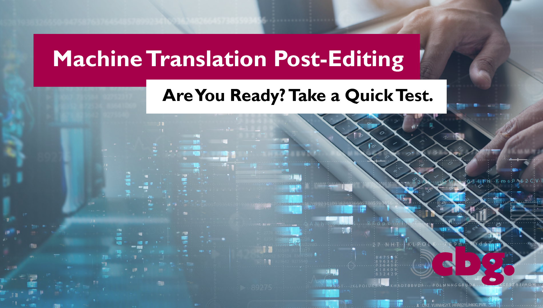
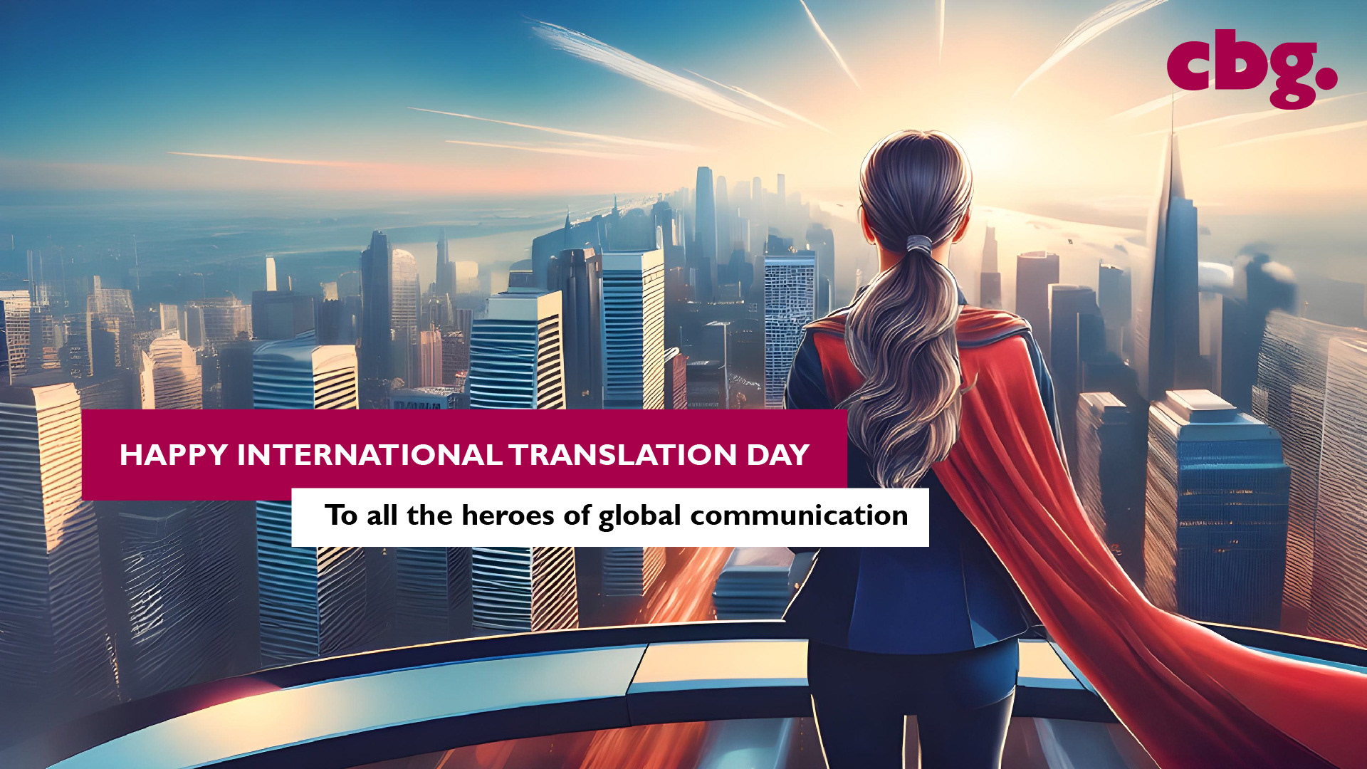
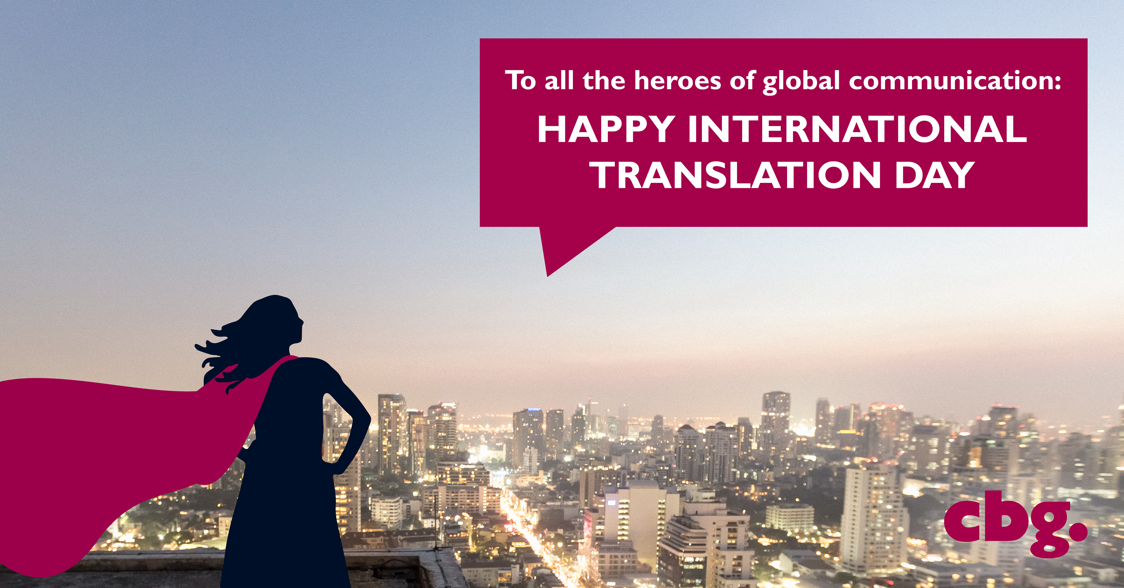
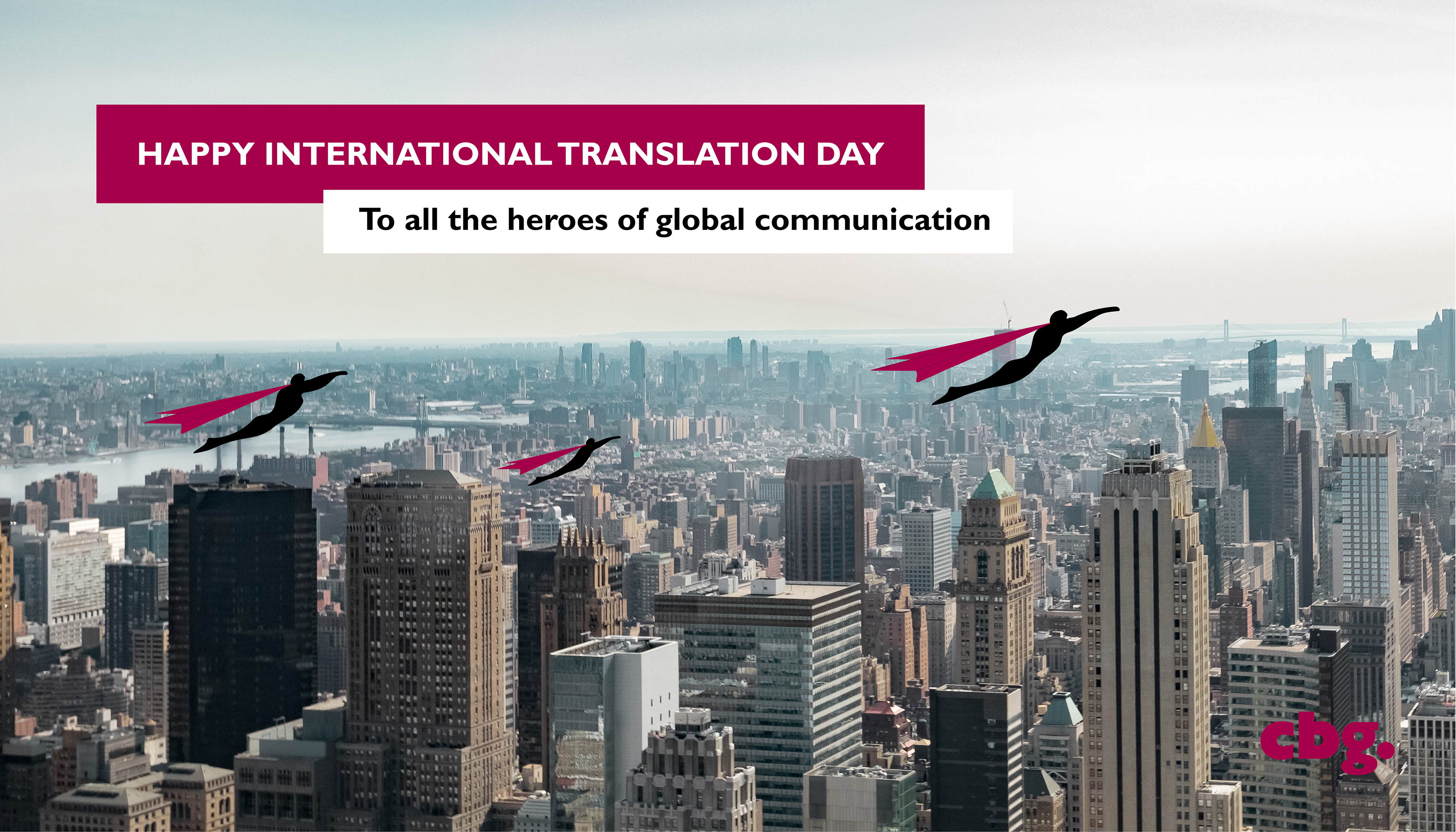
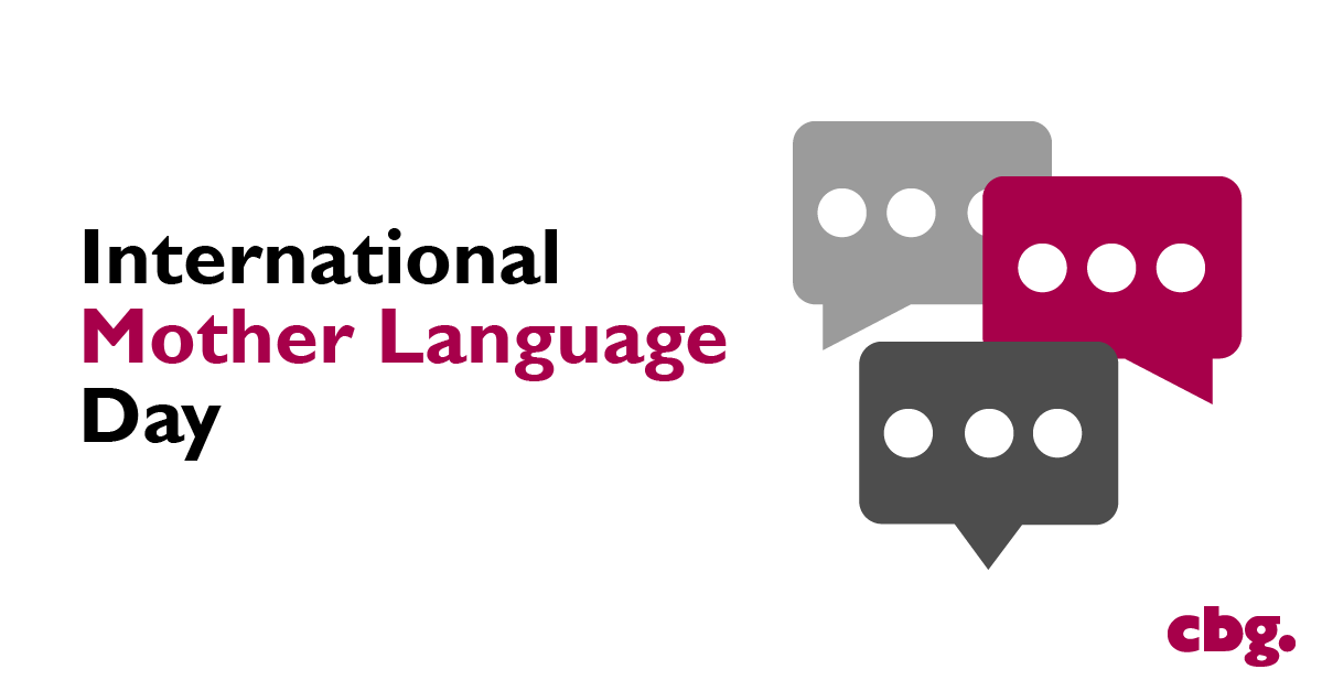
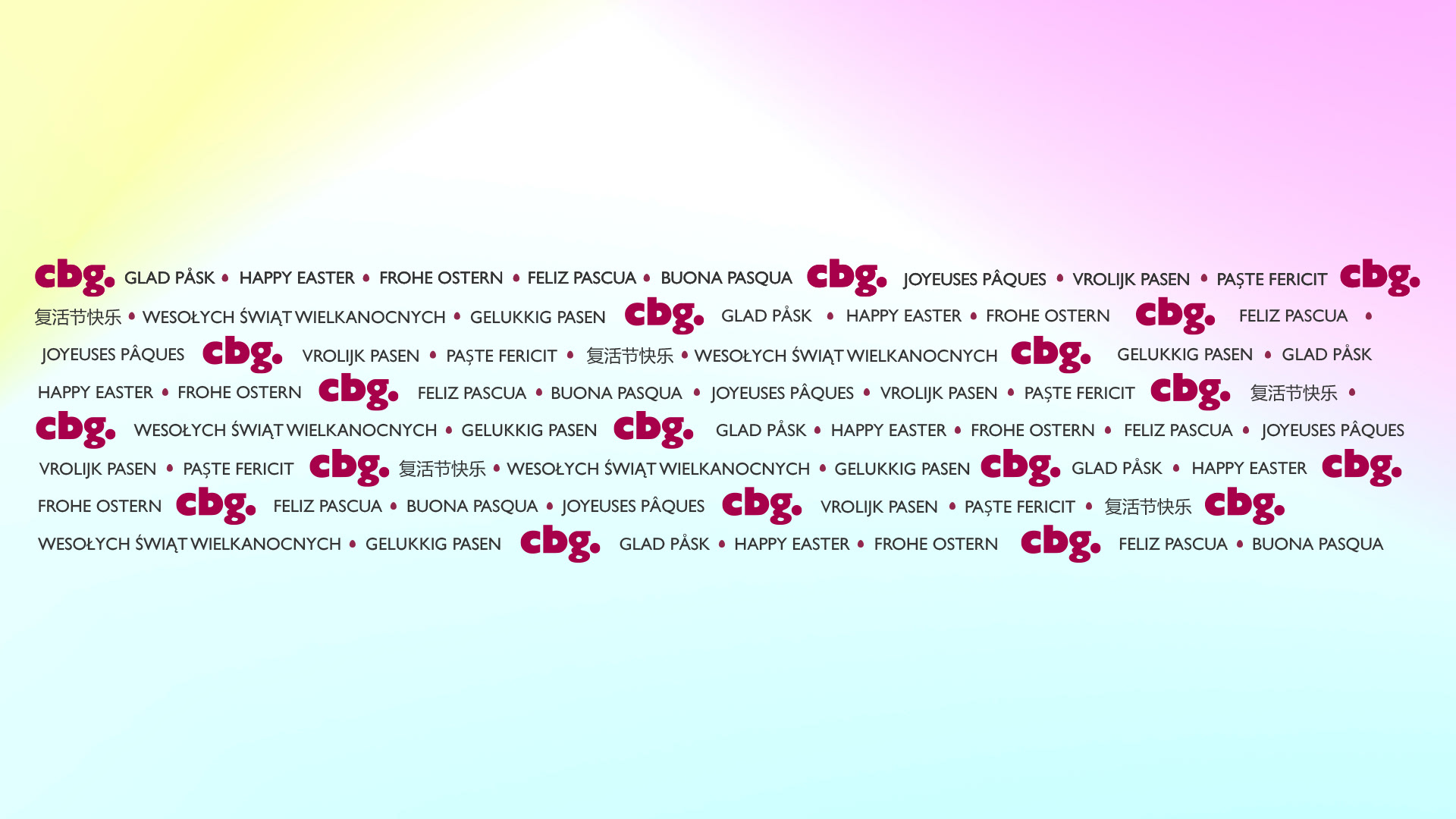
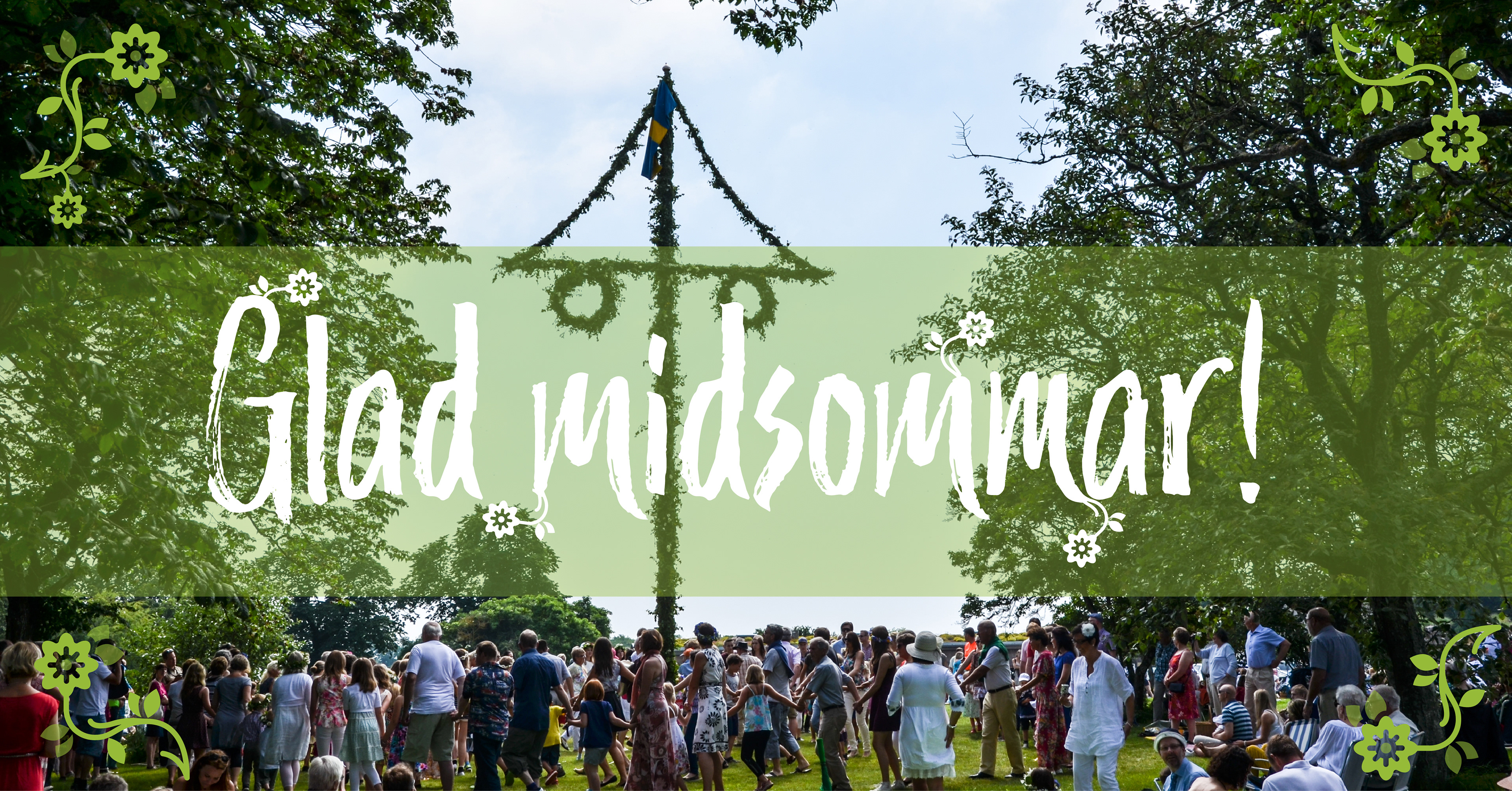
– CBG Brand Identity
– CBG Brand Identity
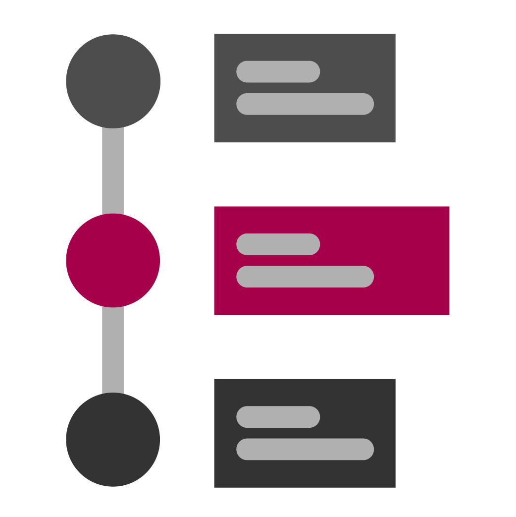
Consistent Branding Across Changing Needs
I created these LinkedIn visuals for CBG across multiple years, supporting everything from recruitment to survey highlights and thought leadership content.
My goal was to maintain a consistent visual identity that felt modern, clear, and distinctly “CBG”—while still allowing flexibility for various topics and messages. Each piece was tailored to communicate fast and effectively on social media, using:
- Bold typography and accent color for clarity in scroll
- Carefully selected imagery that aligns with tone and message
- A layout system that allows new messages to feel fresh, yet on-brand
From light campaigns (like International Translation Day) to more technical topics (like AI and machine translation), I helped ensure that everything still looked like it came from the same place — clean, competent, and human.
In later stages, the creative direction became more constrained, with stricter visual guidelines and less room for exploration. Even within those limits, I focused on clarity, polish, and cohesion — showing that thoughtful design can still resonate, even when working inside a tighter frame.
This project taught me how to balance brand consistency with evolving needs — always looking for the clearest, most human way to communicate.


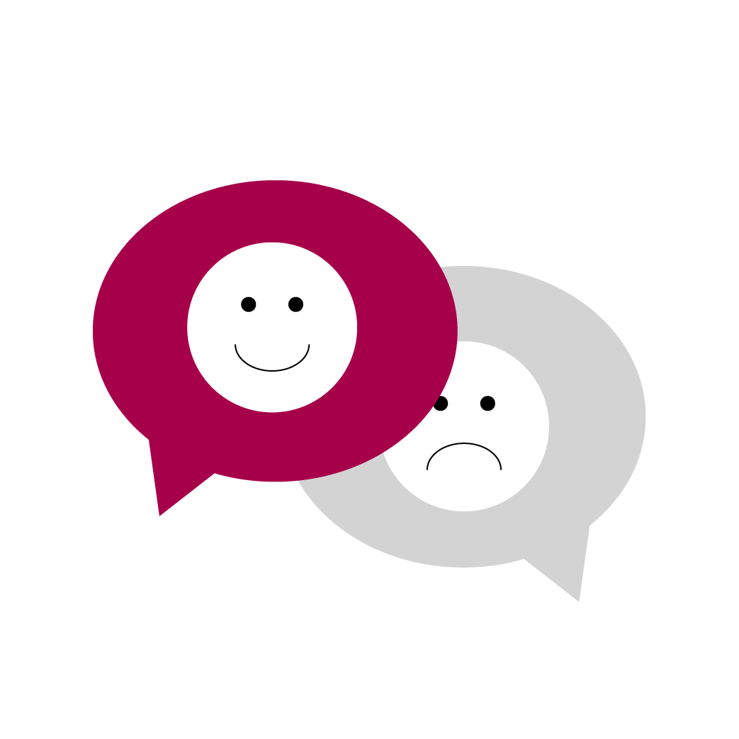
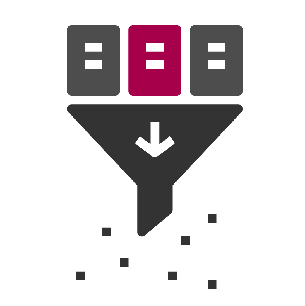
CUSTOM ICON SYSTEM
– For Interface & Communication
– For Interface & Communication
This icon set was developed to support CBG’s internal tools, service overviews, and communication materials—ensuring a cohesive and scalable visual language across touchpoints.
Each icon was either custom-made or adapted from libraries like Flaticon, then refined to match CBG’s brand guidelines—maintaining consistent color usage, visual weight, and semantic clarity.
The goal was to ensure usability and recognition at various sizes and contexts, while reinforcing the brand’s distinct identity.
By treating icons as functional parts of the UI rather than just decorative elements, I helped strengthen both navigation and user trust—making each interaction more intuitive and on-brand.